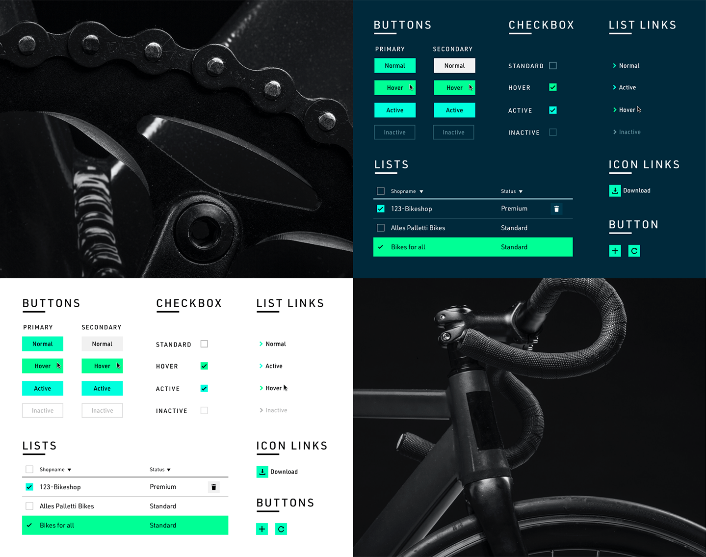
BLOKS. Design System is a project I took part in while I was working as a UX designer at Fluid design.
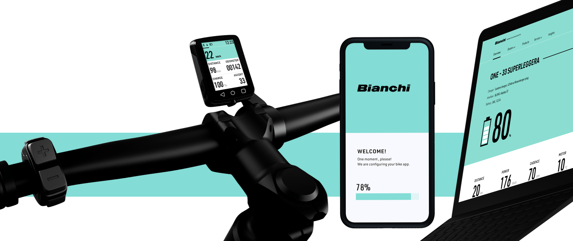
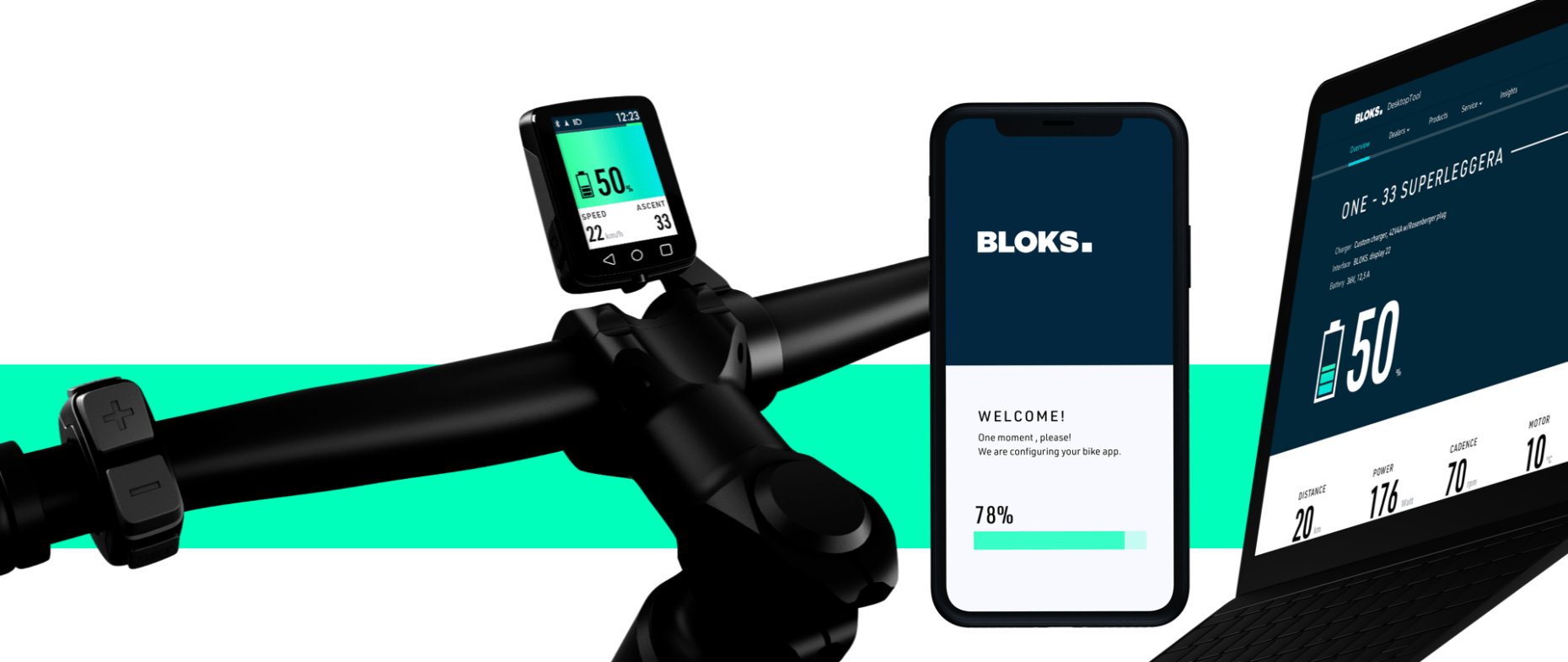
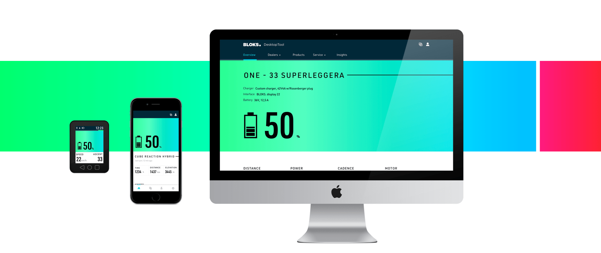
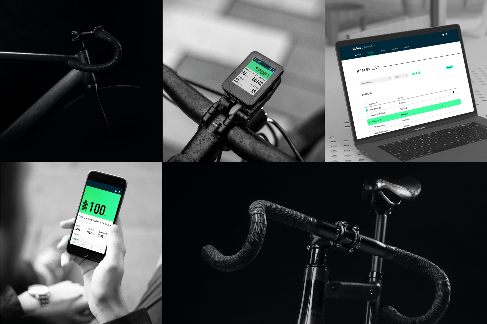
For this project, our challenge was to create a complete design system with all its components and UX touchpoints which could be usable for desktop, mobile and even electric bike devices. Moreover, this design system had to be adaptable to other brands, which required customizable UI components.
Concept
We wanted to tell a story which could embrace the e-bikes mindset which includes energy, freedom, nature and movement, that’s why we got inspired by the natural phenomena Aurora Borealis. This would be the common thread of the entire design system and each component.
We used the metaphor of the Aurora Borealis as the general color story to inform about the status indications such as battery levels or progress bars. The main challenge for the color part was to make sure it could be expandable, accessible and consistent to the brand expression though every device.
Our goal, while creating this design system was to speed up and facilitate the workflow of designers and developers by reducing duplicating of interface elements and establishing a strict systematic consistency.
Deliverables
We created a library that describes the main colors, typography, iconography as well as global UX principles and interaction behaviors of the most commonly used components, across desktop, mobile, and their e-bike device.
Also, as BLOKS intended to be completely customizable for other bike brands, since they offered their services and platform as a white label version. Therefore, we had to create a design system which could be easily adaptable and which could work well with other corporate identities.